When Failure Becomes Part of the Product
I love UX solutions that turn failure into a feature.
Not by hiding the failure. Not by pretending everything worked perfectly. But by asking a more interesting product question:
What should failure feel like here?
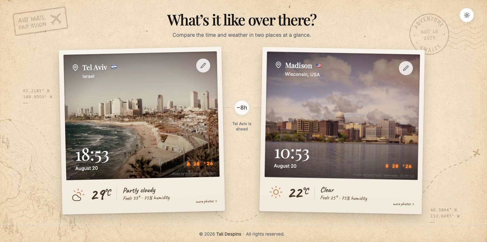
I recently built a tiny app for myself. The original idea was extremely simple: I wanted to see the current time and weather in Tel Aviv, home, and Madison, home #2.
That could have been the entire product.
But, of course, I’m me, and even the smallest app needs to feel legit.
So two cities became any city.
And every city needed a photograph.
Not just any photograph, either. I wanted the entire experience to feel nostalgic and slightly imperfect, so the photos appear as old Polaroids: blur, grain, fade, vignette, a subtle yellow overlay. The whole interface has an old-school quality to it.
It exists mostly to make me happy.
And then iteration did what iteration always does: it exposed a problem I hadn’t needed to think about before.
The moment the happy path broke
As soon as I went from two known cities to any city, I had to ask:
What happens when there’s no photograph available?
The obvious technical answer is a fallback.
No image found. Empty state. Generic placeholder. Maybe some tasteful gray box where the photograph should have been.
Technically, the product would still work.
Experientially, though, it would suddenly stop being the same product.
The interface would go from a carefully constructed nostalgic world to:
- Sorry. Computer says no.
So instead of treating the missing image as an exception to the experience, I started thinking about how it could exist within the experience.
And conveniently, I had already designed the answer.
Your constraints can become your escape hatch
Everything in the app is already blurry, grainy, faded, nostalgic, and deliberately imperfect.
So I created a fallback photograph of an indistinct little town, blurred it heavily, and gave it the same treatment as every other photograph.
Now, when the app can’t find a suitable image, you don’t suddenly fall out of the product.
Instead, it feels like somewhere out there, this obscure little town was photographed once in the sixties, the picture has spent several decades in somebody’s attic, and this is the best evidence we have that the place exists.
Which, somehow, feels completely natural.
The limitation didn't disappear.
It became coherent.
Seamless doesn't mean flawless
I think this distinction matters in product design.
We often talk about creating “seamless” experiences as though seamlessness means eliminating every error, edge case, loading state, missing asset, bad response, or technical limitation.
But products fail.
APIs return nothing. Images disappear. Connections time out. Users enter things we never anticipated. Data is incomplete. AI confidently does something bizarre.
You can spend forever trying to prevent every failure, and you should prevent the ones you reasonably can.
But iteration eventually teaches you that some failures aren't going away.
At that point, the product question changes.
It is no longer:
How do I eliminate this failure?
It becomes:
How does this product fail?
Because failure is also an interaction.
Design the unhappy path in the same language
A polished product isn't one where nothing ever goes wrong.
It's one where, when something does go wrong, the product doesn't suddenly become a different product.
The same design language should survive the failure.
The same personality should survive it.
The same expectations should survive it.
In my case, the visual language happened to make imperfection incredibly convenient. A blurry fallback image doesn't fight the aesthetic. It reinforces it.
But I also didn't want the solution to become deceptive.
So underneath the fallback, I added a little handwritten note explaining that the only available photograph was blurry.
The failure is still disclosed.
It just belongs there.
That's the part I find interesting: good UX doesn't necessarily hide the seams. Sometimes it makes the seams part of the garment.